Wednesday 4th May 2011
Morning
Today our final project brief was introduced. The task that we have been set out to do is create a Creative Media Product for a real client. This can be various things such as a website, a video, a piece of music, a photo-shoot, a poster campaign, packaging, a magazine etc. My initial reaction to this brief is that it looked quite daunting and difficult to achieve, but it also looked exciting at the same time, as it is something that I haven't done before and is likely to build my communication skills and develop my confidence.
I noted down various ideas of what I would like to do for my final project and also noted down various clients that I could choose from, such as a friends parents, the “sound house,’ which is a place where gigs are played and also the hair and beauty salon in college. All these would be ideal for me to carry out photo-shoots and use the collection of images for a brochure or collage for the client, which is what I what I intend on doing in my final project.
Afternoon - Research Techniques
Primary research is research that it carried out by you and doesn’t already exist. Examples of primary research are surveys and questionnaires.
Secondary research is research that already exists, so information from the Internet or in books/magazines. A disadvantage of using secondary research is that information may not always be trusted.
Quantitative research is research that restricts people to answering questions of multiple choices, so usually yes/no answers or on a scale of 1-5. You would use a lot of people if you were to carry out this type of research.
Qualitative research is research carried out in which people can answers questions asked freely with no restriction so that the person asking the questions can get a in-depth understanding of the topic being discussed.
Carrying out research is extremely important, because you need to get a clear understanding of what you are required to do and ultimately benefit the majority of people, which is why primary research is extremely important, because by doing a questionnaire, you can get statistics that tell you what people prefer most. If research isn’t carried correctly or not much research has been carried out in the first place, then it will limit the outcome. An example of bad research is “Pablo the talking dog” - the cocaine advertisement. This was a bad advertisement due to the lack of research carried out, because the target audience were teenagers and many people thought it was stupid that there was a talking dog, because it wasn’t realistic. This could have been avoided if research was carried out correctly.
This afternoon, I also created a questionnaire in order to find out what the most popular type of media is. I did various questions to hopefully get a statistic that tells me which type of media is most popular is a variety of age groups. The research carried out was quantitative so all questions were multiple choice and simple to answer.
Thursday 5th May 2011
Morning
Today, we were given a presentation on how to obtain the best possible brief from a client. We were told what a good brief should contain, which included things such as: a purpose, an audience, objectives, deadlines etc. Also, we were told that it is extremely important to proof read your work, because you don’t want to be submitting any work to your client that has various spelling errors. Also, we shouldn’t be afraid to use our own ideas in the product.
It is extremely essential that you get a design brief from your client, because if you don’t obtain a design brief, then you will have no direction of what your client wants and therefore you could give them something they don’t like. If you have a dissatisfied client, then it can be hugely embarrassing and they are definitely not likely to ask you to produce a product for them again.
Today, I also came to a decision on the client I will be having. The client I will be working for is an Art & Design teacher in my college who wants me to design a brochure of work that has been done in Art & Design as well as photographs of students that did the work.
Afternoon
This afternoon, we were tracing images in Photoshop. I traced an image and used different techniques to see which one worked best. In my opinion, I think this picture worked well and looked realistic:

This image simply has black outlines sketched in Photoshop and has flat areas of colour, which make the image look slightly cartoon like.

This work was inspired by work from Julian Opie. Julian Opie is a visual artist and was born in 1958. Some of his well-known work is when he was asked to design a cover for a compilation by the British band 'Blur', which is where i got my inspiration. Here are some examples of Julian Opie's work:

This is the cover that he designed for Blur. The colours are simple and the work from Julian Opie is work i am going to use as inspiration for my own work.
Here is another example of his work:

This image again is simple and contains flat colours and although there isn't much detail in the image, it works well.
Targets for next week:
My targets for next week are to obtain as much research as possible on brochure design, various colour schemes and different fonts that I could possibly use in my brochure. Also, I intend on analyzing the questionnaire that i've done and possibly find some images from the Internet that I could use as inspiration for my own brochure design.
Wednesday 11th May 2011
Morning
Today, I have been researching into designs for college brochures, because I think that it will be useful for when I come up with design for the Art & Design brochure. Firstly, I have looked at the most recent Art & Design brochure from last year and noted down the various things that it consists of in order to get an overview of what my brochure will more than likely consist of. This research is located in a word document.
Afternoon
Here is a presentation work based on a survey carried out on different types of media:
Below is a screenshot of the questionnaire:

Here is a presentation work based on a survey carried out on different types of media:
Thursday 12th May 2011
Morning
Today, I am going to analyze the questionnaire that a group member and me produced. This questionnaire was done in order to research what the best type of media is and how many people use the different types of media.

My opinions of this questionnaire are that it's good, because it isn't too complex and therefore more of the public are likely to complete it because it won't be time consuming to do so. I also think that the yes/no questions (quantitative research) are good to use as you are getting a definite answer and you can therefore compare answers easy, where as with answers that are "choose from 1-5", people are quite regularly unsure which to choose and therefore research may not be as accurate. Another aspect of this questionnaire that I like is that the questions asked aren't difficult to understand and therefore the majority of people are likely to answer the questions with ease. All these aspects I think improved our overall research.
I personally think that the research carried out was fairly accurate as quite a few questions on our questionnaire received a similar feedback on other group member’s questionnaires. However, not all people in the class think that it was accurate research, as they thought some people were being lazy and couldn't be bothered completing various questions and also they think some people rushed their questionnaires and therefore didn't get the truth, which means that the research was incorrect.
Areas in which I think the questionnaire could be improved are to ask more people, because we only asked 28 people. If we did this, it will make the statistics stronger and therefore research will be better. Also, we could have asked more questions, because this will improve research, because we will be getting more feedback on different things. Also, on some of the questions, I think that it would have ideal to have put "other" as an option, because not everyone uses the Internet and may prefer something different to the options listed on one of the questions. Lastly, I think that the questionnaire would have been improved if we gave the public more answer choices as this looks at other types of media other than just the main four we looked at.
Targets for next week:
My targets that I have set to meet for the following week are to carry out more research and look at various websites that consist of different brochure designs that I can use as inspiration. Also, I intend on designing a rough draft of the brochure and figuring out where each page will need to be located in order for the brochure to fold correctly.
Tuesday 17th May 2011
Morning
Today, I have tried a variety of mood boards to demonstrate some ideas of work I will be using as inspiration for my own work. I created three mood boards in total. Here is the first mood board:


Afternoon
This afternoon, I carried out research in order to find out the best ways in which to design a college brochure. I also looked at various examples of college brochures and gave a description of what I liked and what I disliked. My research is all being noted down on a word document.
I also looked at a couple of articles from the Internet based on colour schemes. Here is this information:

Wednesday 18th May 2011
Morning
Today, I am going to continue with my research and look at the college's guidelines when it comes to designing a brochure. I carried out research from various websites. These included:
Targets for next week:
My targets that I have set to meet for the following week are to carry out more research and look at various websites that consist of different brochure designs that I can use as inspiration. Also, I intend on designing a rough draft of the brochure and figuring out where each page will need to be located in order for the brochure to fold correctly.
Tuesday 17th May 2011
Morning
Today, I have tried a variety of mood boards to demonstrate some ideas of work I will be using as inspiration for my own work. I created three mood boards in total. Here is the first mood board:

Here is the second mood board:

Here is the third mood board:
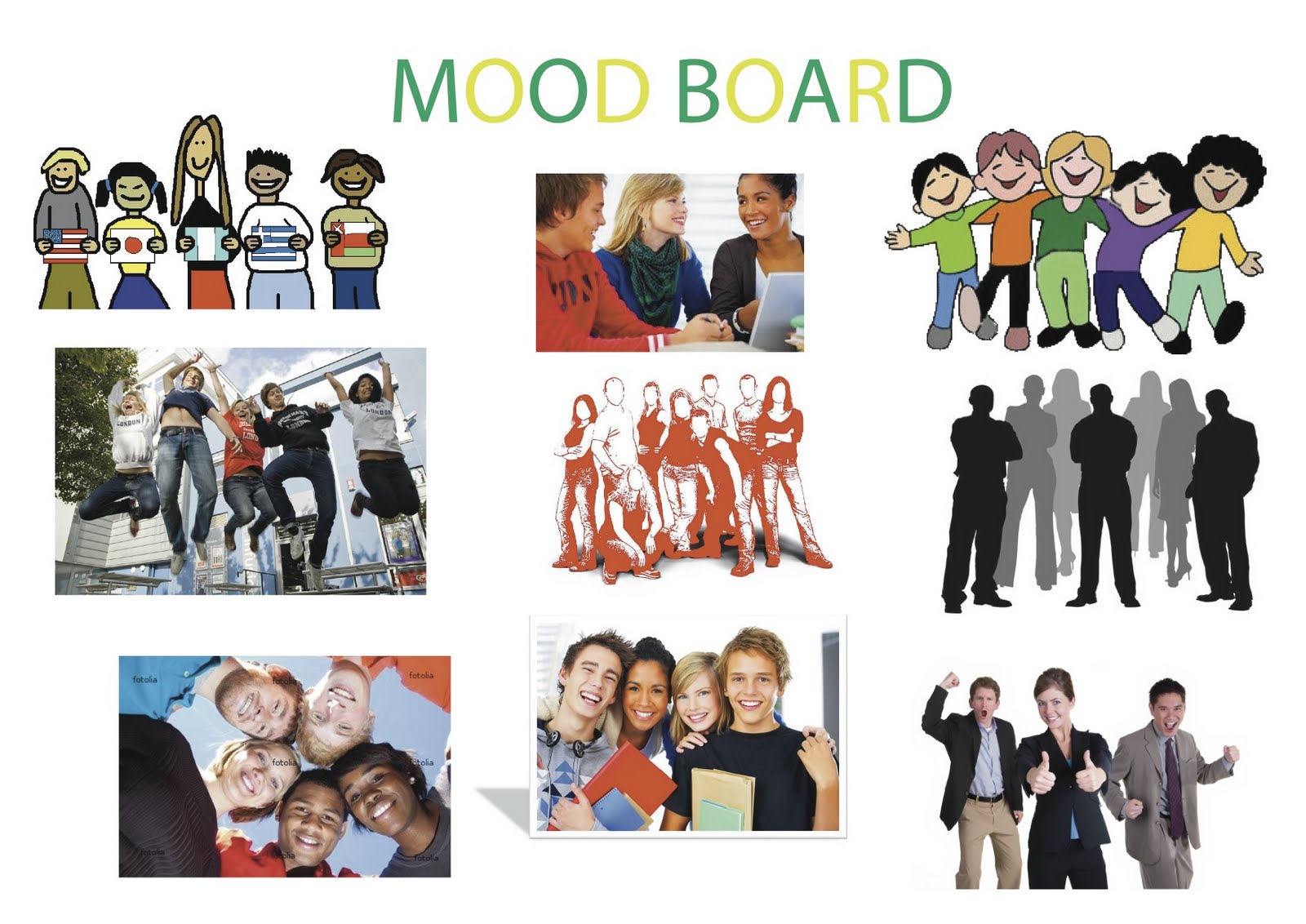
All three mood boards consist of a variety of different aspects and each mood board shows different features of what my brochure will consist of. The first mood board shows a couple of my own rough designs as well as some illustrations that I could possibly use in my final design.
For the second mood board, I have just used images of various brochure designs that I have looked at for inspiration.
For the third and final mood board, I have used a variety of student images that I could possibly incorporate into my final brochure design.
This afternoon, I carried out research in order to find out the best ways in which to design a college brochure. I also looked at various examples of college brochures and gave a description of what I liked and what I disliked. My research is all being noted down on a word document.
I also looked at a couple of articles from the Internet based on colour schemes. Here is this information:
Article based on colour schemes
I am going to summarise an article from the Internet that is based on colour schemes and use this information for my work to ensure that the colour scheme is professional as can be. The first thing that I have done is found an article on colour schemes from wiki http://en.wikipedia.org/wiki/Color_scheme and summarised the information from this article.
Within this article, it states that a couple of the most common colours used within the media industry when you are designing is black text with a white background and is used with a range work, such as hand-outs for students at college and mainly simple work that doesn’t need to attract people’s attention.
Colour schemes are used in order to create style and attract people’s attention and there are various colour schemes that people use depending on the importance of what the person is designing. For simple things, people tend to use a basic colour scheme, which is usually the use of two colours that work well together and are appealing. For a more important thing, such as a brochure design, people tend to use a variety of colours that appeals more so people are likely to pick the brochure up.
The website that I have found my article from is: http://www.colorcombos.com/color-schemes-article.html.
This web page explains how to use a good colour scheme for when designing a web page. However, there are various aspects within this article that are suitable for when I design my brochure and explain the best ways in which to choose a colour scheme that is suitable for what you are designing.
One aspect within this article that I have took notice to is that it states that if you are using a logo within your design, you should try and use one of the colours in this logo to give yourself a basic start for the product your creating so for the college logo that it will be essential for me to use within my brochure, which is this:
I could use one of these colours to use as a starting point for the colour scheme in my brochure design. Also, the website states that you could use a colour scheme selector that can help you choose the right colours for your design.
There are other notes within this article that state that orange is a complimentary colour for blue.
One thing that isn’t recommended is to use a contrast in text colour when typing out text, for example: blue, yellow and red wouldn’t work well together and should be separate.
A quote from this article says, “Sticking with the colors in your logo or header is a sure winner”, therefore this could be a starting point for my brochure design.
Wednesday 18th May 2011
Morning
Today, I am going to continue with my research and look at the college's guidelines when it comes to designing a brochure. I carried out research from various websites. These included:
Afternoon
This afternoon, I started to do a rough draft of my brochure. Firstly, I came to a decision on what software I would be using. I chose Pages. This software is an easy to use, page layout application that was developed by Apple. The first version of this software was introduced on the 11th January 2005 and the most recent version was released on the 6th January 2009.
My opinion of this software is that it is much easier to use than the Adobe software, InDesign. However, InDesign is better if you want the most professional look for your brochure. The part that I found most difficult when doing a first draft of my brochure is figuring out what part of the brochure would go where. This was especially difficult for pages such as the front cover and back page. This is what my first brochure draft looked like:


Here are my final pieces:


My overall opinion of my work is that it all eventually came together after weeks of preparation and designs. I like a variety of aspects of my final brochure design that is shown above, one of which was the inside pages. My opinion of these pages are that all information flows well together and it isn’t too fussy, therefore I personally think people are likely to pick it up at the exhibition. I think that by using the image of the college and placing it behind the student images and statements gives more effect and ensures that the brochure doesn’t look bland. Another aspect of the inside pages that I like are that the images of the Creative Media student’s work are bright and cheery and add a lot of colour to the brochure. Also, the ripped frames that I have used for these images give emphasis and ensure the student’s work is eye-catching, because the main intention of the brochure in the first place is to showcase student’s work. I think that the college image on the front page behind the student image also works very well and is has been incorporated well within the brochure. Also, the colours work very well together and there isn't too much information, therefore it is likely to attract people's attention, because people don't really want to read. In my opinion, although the back page has a lot of information, it has been set out well and it's simplicity of having just two illustrations ensures that it isn't fussy and meets the clients requirements. These are my personal opinions of the aspects that I like of the brochure I created.
This afternoon, I started to do a rough draft of my brochure. Firstly, I came to a decision on what software I would be using. I chose Pages. This software is an easy to use, page layout application that was developed by Apple. The first version of this software was introduced on the 11th January 2005 and the most recent version was released on the 6th January 2009.
My opinion of this software is that it is much easier to use than the Adobe software, InDesign. However, InDesign is better if you want the most professional look for your brochure. The part that I found most difficult when doing a first draft of my brochure is figuring out what part of the brochure would go where. This was especially difficult for pages such as the front cover and back page. This is what my first brochure draft looked like:
Outside of brochure

Inside of brochure

From this, you can see that when doing a rough design of the brochure, the front cover had to be located at bottom right hand side of the page. In order to help me when doing the design, I separated the A3 paper into 6 equal sections so when it was folded, everything was in the correct page.
One part that I did incorrectly when doing the design is that I put the introduction in the wrong place. As you can see, the introduction is at the top right of the page when it should be located at the top left. The inside of the brochure wasn't as difficult to do, because everything was able to appear the right way up. My intention of this rough design was to locate where everything will be going in my brochure. However, my final brochure will look nothing like this. After I did this, I printed it out and folded it to make sure all the work was in the correct position and didn't lap over onto another page.
Thursday 19th May 2011
Afternoon
Today, I annotated the first draft of my brochure. I also put on a couple of ideas of what I could use to make the brochure look more effective. These included rotations on the imagery as well as colourful sub-headings to create an impact to the readers.
Targets for next week:
The targets that I have set for next week are to use the brief that I will be receiving and ensuring that I firstly meet all the requirements from that by planning out where my client wants all the important information to be located. Also, I intend to plan my proposal through the week and create the proposal in Powerpoint ready to be presented next week. Also, I intend to evaluate the proposal that I would have presented to the class by next week. Lastly, I think that by next week, I definitely need to have done some sketches of images for my brochure, so that is another intention that I will do by the end of next week.
Wednesday 25th May 2011
Today, I was given my brief. However, it wasn't the same as what was first planned. I will still be doing a brochure for the Art & Design exhibition, but specifically for the Creative Media Section and also for Emma Leivesley.
After looking at the brief, there were various aspects that I needed to take into account. The definite things that need to be displayed on the brochure are:
Front Page
- The college logo, address, contact number and college website.
- Also, opening times with date.
Inside Pages
- Images of students work as well as positive statements about the course.
Back Page
- A list of courses that will be available in September.
It is also important that I keep a consistent font throughout as well as ensuring that the brochure isn't too fussy.
These aspects definitely need to be taken into account when designing the brochure. However, the rest is down to me.
Today, I created a proposal of what I will be doing and how it will be done and things that could go wrong.
Here is a presentation on Powerpoint of my proposal for the final major project:
Tuesday 31st May 2011
Today, I firstly started by evaluating the proposal that I recently presented. Here is the evaluation:
Evaluation of Proposal
I presented my proposal on the 26th May 2011. I think that it went well. However, there were also various aspects of the proposal that could have been improved.
For my proposal, I included a mood board of various brochures with the same layout to what I’ll be using. Also, I included some of my own work, which I did in the software Pages. In the presentation, I also included what I will need, such as money for printing, software and equipment for taking pictures of work and students. I also included possible problems that could arise whilst designing my brochure, which included time constraints, money problems and ethical issues. There were also many other aspects were included in my presentation.
In my opinion, I think that overall I did a good presentation and covered a variety of different things necessary for when I design my brochure. I felt as though I spoke with confidence and spoke clearly with clear pronunciations. I also included ideal things such as a mood board.
Negative points that I felt about my presentation are that I could have connected more with the class as well as not be so reliant on the information in the presentation and improvise more when not sure what to say rather than always look at the board.
Class members said that I spoke with confidence and was clearly spoken. Also, they said I gave good detailed explanations and justified myself throughout the presentation. They also said I had a good use of a mood board and that my Gantt chart was clear and understandable. Negative feedback from the class were that they said I could have prepared better for the presentation in terms of what I was saying and also I could have included less information on a couple of the slides. Overall, they said it was a good presentation.
If I were to do the presentation again, I would ensure that I connected with the class more and try not to look at the board so much. I would also include more necessary information to explain thoroughly what I am going to do in my design.
Today, I also had a meeting with my client Emma in which she gave me some direction of what to do. This was to include at least 3 mood boards (each being different). Also, she mentioned about talking about a variety of colour schemes and research different ones. She also mentioned that she will be providing me with images of the students and their work. Also, it is extremely important that i show evidence of sketches and I should research into a variety of fonts in order to see which ones work best.
Thursday 2nd June 2011
Morning
Today, I have been carrying out research from kuler.adobe.com into a variety of colour schemes that I could possibly use for my brochure design. I have decided to keep the colour scheme consistent throughout, but avoid the brochure being dull. The reason why I want to keep the colour scheme consistent is because with too many different colours, the brochure is likely to look fussy, which isn't what my client wanted.
Today, i also looked at various images that I could possibly use within my brochure. Here is an example of one of those images:

The reason why I think that this would be a suitable image is because it has smiling students each holding a different countries flag. This in my opinion works well, because the college has many students from a variety of different countries and this image shows that the college and the creative media course welcome's people from all countries and different walks of life.
Here is another image:
This image in my opinion is good, because the students are all happy and cheery and I personally think that it would fit in well with my brochure design.
Afternoon
This afternoon, the first thing I did was hand draw an image on paper. The image I sketched was the one above and I got this:

I am now going to change this image in Photoshop and show the various stages I went through in order to achieve the finished image. I'm firstly going to change the levels by simply going to image, adjustments and then levels. This will make the background clear white and darken the lines of the drawing. This is what it looked like:

From this image, you can see that the image is clearer and the back is just clear white. I am now going to trace around the shape using the soft round brush. This is the what i then ended up with:

I am now going to add colour so that the image is attractive.
This is what the image now looks like:

I am now going to try a different way of adding colour. To do this, I am going to choose a picture from the internet in which I can pick an item that I like the colour and design of to use on one of the people in the image. After i've done this, I paste the picture into a photoshop document and use the rectangular marquee tool in order to select the colour I want on the picture i've got. After i've done that, I copy the colour and then use the magic wand tool to select the part of the image where I want the colour to go. I then go to edit, paste special and paste into in which it will paste the exact colour from the image. I am going to do this for the whole picture.
This is what i got as a result:

Targets for next week:
My targets for next week are to plan my brochure design and do various sketches of different brochure design that I could possibly use. I intend to put images in different places on the brochure and do the same with any text. From this, I intend to use the ideas that I like and use this in my brochure. By next week, I definitely want to have made a start on my brochure design and get a rough idea of where most things will be located within my brochure design.
Planning
Tuesday 7th June 2011
Today, I am going to start designing the actual brochure that I will give to my client. The software that I will be using is Pages, as it is an easier software to use than InDesign and also is suitable for designing brochures. The brochure will be a 4 page A5 brochure equivalent to this following image:

After carrying out sufficient research into various colour schemes, fonts and brochure designs, I feel as though i'm ready to create the brochure up to my client's standards.
The first thing I have done when designing my brochure is to figure out where each page will go when I design the brochure in Pages. I did this by thinking of where each page is likely to go and then printing to see whether I was right and it folds correctly. I firstly did it wrong and put the front and back page on the wrong side and had this:

I am creating the inside of the brochure on one document and the front and back pages of the brochure on another A4 document so that when its printed, it will fold into an A5 brochure.
These are the two documents and where each page will be situated so that it folds correctly:


The line going through the middle are just there so that I know where the exact half way point on the A4 paper is. However, when printed, they don't appear. This is where each page will be situated so that everything is in the correct position when printed and folded.
Today, I have also done a hand-drawn sketch of where everything will be situated in my brochure and so that I have a guide of what to do whilst designing my brochure.
I have also scanned my brochure sketch so that i could upload it into the blog. This is the sketch:

Wednesday 8th June 2011
Morning
Today, I have carried out research into a variety of brochure/leaflet designs and looked at the layout, colour schemes and imagery of them all in order to see which is likely to work best for my own brochure. All this research has been noted down in a word document.
I have also done another two hand-drawn sketches planning what my brochure is likely to look like and different ideas to how I can go about it.
Here are the other two hand-drawn sketches:
2nd sketch

3rd sketch

As ya can see from my sketches, the front page has to be on the right and the back page on the left. This is because when I fold the brochure, it will fold correctly when the pages are in these positions. I think that all three of my sketches are suitable to use and I am now going to start designing my brochure based on all three of them and see which ideas from each brochure design work best.
Brochure Design
Afternoon
This afternoon, I am designing the actual brochure. I am going to do each page separately starting with the front page and make notes of aspects of my design that didn't work and things that did.
The first thing I did when designing my front page was put all the important information that given to me in my brief. Firstly, I put the college logo in the top right hand corner. I then started to add some text by putting the title at the top of the page. For this, i used the chalkboard font, because I think that it looked suitable for a title and it was funky. This is a screenshot of the font I used for my title:

As ya can see, the font is attractive and isn't boring and is the reason as to why I used it. I kept the font in black, because black looked best for the title, but I tried out various colours previously. After I wrote the title, I wrote a list of subjects that are part of the Creative Media course on the left hand side of the front page. This is a screen shot of the list:
I did this because straight away, it allows the viewer to see what subjects are part of the Creative Media course and see what may be of interest to them. I kept the front black, because it's simple and not too fussy and i don't think that any other colour would have been necessary for this little bit of information. After I did this, I then created a text box and put the time and date of the exhibition in this. I put this information in the bottom left hand corner of the front page. I used a relatively small font for the text with font size 10. Here is a screenshot of this information:
Again, I have kept this information in a simple font, because it's only the time and date and therefore there is no need to make it fussy and colourful. After this, I then decided to add the college details with the same font (foco) and same font size as the time and date. Here is a screenshot of this information:
I kept the address, number and college website separate from each other so that its easier for the eye to read and not crammed together. I also kept the college website in a dark blue font and underlined it so that it stood out more. After I did this, I created another text box and typed CREATIVE MEDIA in it, as this is what the brochure is advertising. As this is an important part of the brochure, I used the 'desdemona' font and used font size 27. I also used a dark red colour for the text so that it was eye-catching and attractive. Here is a screenshot of this:
After I did this, I then used an illustration image for my front page. This was to simply make the front page more attractive and eye-catching. Here is a screenshot f the image that I used:
I think that this image is good, because its relevant because of the 'Art & Design' text on the image and is the main reason as to why I used it. The last thing that I did on the front page was add an image of happy students. This was to ensure that the brochure had more colour and wasn't bland and boring. This is a screenshot of this image:
For this image, I gave it an effect by adding a frame from the drop down list in the toolbar at the top of the document. This is the one i chose after i clicked on the drop down list:

I chose this, because I think that it worked well on the front page of my brochure. Below is a screenshot of the front page all together:

This at the moment is a rough draft of where images and text will be going, but is likely to change a lot through the process of designing my brochure.
Thursday 9th June 2011
Today, I have started designing the back page of my brochure. On this page, it is very important to contain the information that is stated in the brief, which is information that are available on the Creative Media course and courses that are available in September 2011. On this page, I firstly started by creating a text box and typing the information in the brief. Here is a screenshot of this information:

For this, I firstly started by typing the information using font size 12. However, this resulted in there not being enough room for the other information that needed to be added, therefore I changed the size of the font to 10. I kept the headings in bold and font size 12 just for emphasis. I also used the college font 'foco' for this information. In my opinion, it is important to keep this information in a basic style, because it wouldn't look right if it was in bright colours and a wacky font.
After I typed out this information, I created another text box and then typed in the courses that would be available to students in September 2011. I did it in the exact same style as the screenshot above. Here is a screenshot of this information:

On this page, I haven't included anymore information or imagery. However, I do intend to include some illustrations when my brochure design develops. Here is a screenshot of the back page so far:

Now that I have roughly drafted out my front and back page, I am going to do the inside pages. I am going to use various aspects from the sketches that I did above and use these ideas in my brochure design. For the inside, I am going to have the introduction on the top left hand side of the left page and underneath, I am going to have student's artwork. On the right page, I am going to have images of student's and positive statements about the Creative Media Course.
Targets for next week:
By next week, I hope to have sorted out images of student's that I will be using from the Creative Media Course and obtain a positive statement from each of them. I also intend to start finalizing my brochure design ready for product testing and ensuring that its suitable for the client.
Tuesday 14th June 2011
For the images that I use in the inside of my brochure, I am going to use different effects for them. This will include rotating the images so that they appear a little bit slanted. Also, I am going to use a frame effect so that it flows better within the brochure. The first thing that i've done for the inside part of the brochure is a text box for the introduction. I then got some text from the 'lorem ipsum' website to fill in the text box. Here is a screenshot of the introduction (rough draft):

I am now going to add some of the student's art work at the bottom half of the left page. I will be using different effects on these images. Here is a screenshot of the images that i have used and the effect i've used for them:

For these images, I have used a plain, black frame for two of the images and a brown frame for another two. I think that this gives the images more effect and makes it look better in the brochure. Here is a screenshot of the left page:

This is a rough draft and is likely to change through the process of creating the brochure. However, I think that its suitable for a brochure in its current state and therefore I am not likely to change this page much. The last part that I designed of the brochure was the right hand page of the inside part to the brochure. For this, I used three images of students and located the images in the position i wanted them to be and I then obtained a little bit of text from the 'lorem ipsum' website for the positive statements so that I could get a rough idea of what the brochure is likely to look like. On the images, I used the effect shown below in a screenshot:
I think that this frame moulds the images better into the actual paper and works and looks the best out of all the frames I tried.
Here is a screenshot of the right page:

Although, this is the layout I intend to go for when designing this page of the brochure, I will be using different people for the images.
Also today, I am going to take photographs of students in my class and get a positive statement from each about the course. I am going to use two students and myself and get each student to write a positive statement about the course. These are the images that I will be using for my brochure:


Now that I have obtained the student images for my brochure, I will be editing them a little bit in Photoshop so that they look sharper and cleaner. These are the above images after they were edited in Photoshop:


I have cropped a couple of the images and used various tools, such as the spot healing tool and I also went to filter and liquify to increase the size of the girl's lips, as she wasn't happy with them in the previous photo.
Each person has now written and given me a positive statement about the course so my next step is to incorporate these images and the positive statements into my brochure.
Wednesday 15th June 2011
Today, I have started by putting the photo's of the students and their positive statements into the inside section of my brochure. I used a text box for each positive statement and had each statement in a different colour. Each statement was in bold for effect and I used foco font for this text. Also, I changed the font size of the text to font size 9. This was because I couldn't fit the student's name on with any larger font and maintain the brochure looking like a professional brochure. Also, each positive statement was in a different colour. This was because I personally think it looked better rather than each statement being in the same colour and looking a slight more dull. For the student images, I used a frame effect so that the images looked better and more realistic in the brochure. Below is a screenshot of the students with their positive statement:

My personal opinions of this page are that all the images and text work well together and although the font size of the text is small, it is still easily readable. I think that the effect on the images also looks good and also, I have used a black shadow for each of the images to give more effect and ensure that the brochure looks more professional. I doubt that I will be changing this part of the brochure much, as I think that it looks good in it's current state.
Thursday 16th June 2011
Today, I have decided to add a college shot to the brochure. I tried a variety of locations on the brochure to where I could put it, such as behind the introduction. In the end, I decided that it looked best on the inside part of the brochure where the students and their positive statements are located. Here is a screenshot of this page:

I think that with this college shot, the brochure looks better and more attractive. In order to make it look good and still ensure that the writing stood out, I reduced the opacity of the image to 25%. I also sent the image to the back by simply going to arrange and send to back.
Today, I also used another college shot for the front page of the brochure. I located this in the middle of this page, because I think that it worked best there. On the front page, I have also included some illustrations so that the brochure is colourful and attractive and people are likely to pick it up. Here is a screenshot of the front page:

I think that this front page works well together and the college shot fits in well. However, I am unsure as to whether it may be a little too fussy and therefore I am going to get feedback from my client and find out whether it meets her requirements.
Another idea that I have tried is using some of my own work with the image of the students in the screenshot shown below:

Although I like this idea, it is definitely too fussy and there is too much on one page and I therefore won't be using it, as it specifically says in the brief that my client doesn't want the brochure being too fussy.
Afternoon
This afternoon, I have decided that I am going to change the back page of the brochure slightly. In it's current state, I personally think that it has got too many illustrations and it looks a bit fussy. Also, the illustrations that I have got don't relate as much to the subjects, where as there are others that do. Here is a screenshot of the back page at the moment:

As you can see, there are quite a few illustrations and therefore it looks a bit crammed and fussy. Also, this page is informing viewer's of courses that are on offer within the Creative Media Course and none of the courses specifically relate to Art & Design and I therefore thought it was unnecessary to have the Art & Design images. Also, i think that the person with the text is quite pointless, as again it isn't really relevant. Due to this, I have decided to choose images that are more relevant to the Creative Media Course. There are a lot of courses related to Photography, therefore I kept the camera image and also, there are courses related to Web Design so I obtained an illustration of a person with a computer. I thought this would look better and not too fussy as well as relating to the course a bit more and is the reason as to why I decided to change it. Here is a screenshot of the back page after the changes that was made:

This in my opinion works better and meets the brief requirements for the brochure not being too fussy.
In the inside of the brochure, I have decided to add one piece of my own work and i've tried to incorporate this image so that it works well with the other Art Work images. Also this afternoon, I have typed out an introduction for the brochure and for this, I used the foco font and used font size 10. Here is a screenshot of this page now that it has been developed further:

On this page, I have also included more of the student's work than what I had done previously. I think that the frames on the images work well together and are more effective. I have changed the fonts of the titles both to 'chalkduster'. This is because previously I had a few different fonts and chalkduster was my favourite font and I needed to ensure that the fonts were consistent throughout the brochure, therefore I changed all the heading fonts to 'chalkduster', which I think works better and looks more attractive.
Today, I have also tried out a different layout of my brochure to see which one looks better. In order to decide which one is best, I will be printing it out and comparing it with the other brochure layout. I will be asking a fair few people which they thinks best and then make a decision of which one to use based on the majority vote. Here is a screenshot of this new brochure layout of the inside pages:

Targets for next week
By next week, I definitely intend on finishing my brochure design and also want to carry out a couple of surveys on my brochure designs in order for me to make a decision on which brochure design is best based on people's opinion within the college and outside the college.
Wednesday 22nd June 2011
Today, it is important for me to get my product completed to the best possible standard. The Art Work images that I have used are now going to be changed so that they are relevant to Creative Media rather than Art & Design. I am now going to choose what Creative Media work I will be using to showcase in the Art & Design Exhibition.
This the first image that I will be using for the student's work:

Below are the other images that I will be using for the student's work:


In my opinion, these are good images to use, as they cover a range of different subjects from Web Design to Photography to work completed in either Adobe Photoshop and Adobe Illustrator. Also, the images add a lot of colour to the brochure and this is eye-catching. It also includes some of my own work, which I think is important, as i've designed the brochure.
Today, I also had a meeting with my client and she mentioned any parts about the brochure that needed changing a little or any information that needed to be added. This included changing the list of Creative Media Courses as well as altering one of the courses on offer in September 2011. I also needed to alter the college number on the front page, so that it was the Art & Design number rather than the specific college number that everyone would normally ring when they have a query.
Today, I used another idea and changed the inside of the brochure a little by adding a variety of Illustrations. Here is a screenshot of the inside part of the brochure now:

In my opinion, I think that it looks okay and the brochure looks more attractive. However, in my brief that I obtained, it specifically states that the client doesn't want the brochure to be too fussy and in my opinion, with the large amount of Illustrations, the brochure is a slight bit fussy, therefore I won't be using this idea for when I complete my final design.
Today, I also had a class photo taken of all the people involved in the Creative Media Course. Here is the image:

This was the best image of the photo's that were taken, therefore I chose this one to use for my brochure. I then placed it on the front page after editing the flash in Photoshop.
I have now completed both the inside and the outside pages of the brochure ready to be submitted to my client. Here is a screenshot of the inside pages of the brochure followed by a screenshot of the outside pages of the brochure:


This is the design for my brochure that I will be using for my client. In my opinion, it works well and the images used work well together and are relevant to the Creative Media subjects. Also, there are a lot of different colours that have been used with the images, but it doesn't make the brochure look too fussy and also keeps the brochure professional and realistic.
Product Testing and Analyzing
Also today, I have printed various designs so that I can test the product. I am going to carry out a survey in order to test my product. To do this, I am going to print various brochure designs that I have thought of and ask 25 people what brochure design they think is best. I am doing this so that I can choose the brochure that the majority of people think is best or choose different aspects from each brochure that people thinks good and then merge the best features about each brochure into one final brochure design ready to be submitted to my client.
The first survey that I have carried out is based on the inside of the brochure and what design they think is best. To carry out this survey, I designed a questionnaire in Microsoft Word. However, the designs weren't large enough for people to clearly make out, therefore I couldn't use Word. Here is a screenshot of what the questionnaire looked like:
Here is a screenshot of each design starting with design A
Design A:

Design B:

I am going to do a graph of my results in order to show which design people prefer most. Here is the graph:
Now that I have done this, I am going to show 25 people various designs of my front page and see which one they prefer most and from this result, make a decision as to which one I will use: There are 5 different designs in total. Here are screenshots of the 5 designs:
Design A:

Design B:

Design C:

Design D:

Design E:

Design F:

Design G:

For this, I created a questionnaire. However, some questions proved more difficult to ask than others, because I had to base the question on the specific design people had chose. Also, I had to do two questionnaires, one based on the front page of the brochure and the other based on the inside pages of the brochure.
Here is my questionnaire for the front page:

Here is my questionnaire for the inside pages of the brochure:

Both questionnaires are fairly similar. I did this because it would allow me to get an insight into different areas of the brochure rather than the brochure as a whole. This in my opinion would make my product testing and analysis stronger.
Wednesday 29th June 2011
I have now asked 25 people to fill in a survey and I am now going to do a tally showing which design is preferred and their opinions and the I will do a graph in order to show which Front Page design is most preferred. Here is the tally chart:
Front page Tally
Design A 1 1
Design B 111111111111 12
Design C 1 1
Design D 1111 4
Design E
Design F 111 3
Design G 1111 4
Did the person like the layout of their chosen front page
Yes 111111111111111111111111 24
No 1 1
Did the person like the design of their chosen front page
Yes 111111111111111111111111 24
No 1 1
What people thought of the colour scheme of their chosen brochure ( 1 being very bad and 5 being excellent)
1
2
3 1111111 7
4 111111111111 12
5 111111 6
Inside Pages Tally
Design A 111111111111111111111 21
Design B 1111 4
Did the person like the layout of their chosen inside pages
Yes 1111111111111111111111111 25
No
Did the person like the design of their chosen inside pages
Yes 11111111111111111111111 23
No 11 2
What people thought of the colour scheme of the chosen inside pages (1 being very bad and 5 being excellent)
1
2 11 2
3 11111 5
4 11111111111111 14
5 1111 4
I am now going to show all this information in a variety graphs on Powerpoint:
Here is the Powerpoint presentation of these graphs:
I am now going to analyse these results:
For the first graph that I did, which was the graph on the most preferred front page, the result that I got was that Design B was the most preferred brochure with 12 people choosing this as their favourite front page. Design E was the only design that nobody chose. In my opinion, I personally don't think that Design B is the best front page design, but the reason I think the majority of people chose it are due to the background image that covers two thirds of the front page. I think that this engaged their attention right away and is the reason why they chose it... Because it stood out more than the others with the background image of the college.
For the second graph that I did, which was the graph on the most preferred inside pages, the result that I obtained was that Design A was a definite favourite with a massive 21 people out of 25 choosing this design. My personal reasons for this are because people think that it was set out better and it flowed better with the images of students being on one side rather than separated between the two inside pages.
For the third graph, which was how many people liked or disliked the layout of their chosen front page, the result that I obtained was that 24 out of 25 liked the layout of their chosen page.
For the fourth graph, I did the same as above, but for the inside pages and the result that I obtained was that every person surveyed liked the inside pages they chose as their favourite design.
For the fifth graph, which was how many people liked the design of the front page they chose, the result I obtained was that 24 people liked the design of their chosen design.
For the sixth graph, which is the same as above, but for the inside pages, the result I obtained was that 23 out of the 25 people surveyed liked the design of these pages.
The seventh graph that I did, which was based on what people thought about the colour scheme of the front page they chose as their favourite (1 being very bad and 5 being excellent), the result I obtained was that 12 people rated the design they chose as a '4' and 7 people rated it a '3' and 6 people rated it a '5'. Nobody rated the designs less than a 3.
For the final graph, I did the same as above, but based on the inside pages the people chose as their favourite design and the results that I obtained were that the majority of people rated the inside pages as a '4' with 14 people doing so. There were 4 people that rated it as a '5', 5 people that rated it as a '3' and 2 people that rated it as a '2'. These were the results that I obtained and are shown in the above graph.
From these results, it is clear to see that Design B is the favourite design of the front page and Design A is the favourite design of the inside pages. Also, it is clear to see that the majority of people like the layout and design of the designs they chose on both questionnaires and they also like the colour scheme with the majority of people rating the colour scheme of the brochure designs as at least a '4'.
Targets for next week
My main target for next week is too complete my evaluation and submit the final major project.
Tuesday 5th July 2011
Morning
The final thing that I am now going to do is evaluate my work.
Final Major Project – Evaluation
When I first received the brief for my Final Major Project, the task that we were required to do looked really daunting and fairly difficult. The task that we were required to do was to firstly find a ‘real’ client and then obtain a brief from the client of what they want you to do for them. Within the first week, I had my client and although I didn’t have a brief right away, the product that I was to design was a brochure for the Art & Design Department, but more specifically for the Creative Media section.
I didn’t have a brief until 3 weeks after we were first given our project brief; therefore my main intention was to carry out as much research about the product and look into various colour schemes, (kuler.adobe.com) being the site that I used for colour scheme research. I also looked into a variety of font styles that I could possibly use for my brochure. The main aspect of my product that I carried out a lot of research for was different brochure designs. When doing this research, I firstly looked into past brochures from the years 2009 and 2010. I commented on these brochures noting down what each brochure consisted of and the colour schemes and fonts that were used. I did research on past brochures so that I could incorporate aspects of these brochures into my own brochure design. After I’d carried out research on brochure designs, I also looked at a variety of brochure layouts and looked at which brochures worked and which ones didn’t. This allowed me to choose which brochure layout looked best.
Throughout the process of this Final Major Project, it was extremely important to keep a log of everything that you were doing, therefore I opened a blogger account and wrote down every bit of work that I had done on each day. This was very important to do, as it explained the process you went through in order to achieve each part of your product design.
When I obtained a brief, it was then time to put all the research I had carried out into practice and begin the design for my brochure. When designing my brochure, I thought that it would be better to firstly design the front page of the brochure and note down all the necessary information from the brief that was required to go on the front page. After I’d done a draft for the front page, I then did the back page and lastly, the inside pages of the brochure. I changed the design of the brochure multiple of times until I achieved what I thought looked best. I also changed the layout of the brochure as well as included illustrations on some designs and not on others. I changed the placement of images as well as text until I finally achieved the final design ready for submission to my client. So that I knew which brochure design worked best, I tested the product designs that I had done by asking about 40 people what they thought of each brochure design I had done. I had some positive feedback as well as some negative. The negative feedback I used constructively in order to make my brochure better. The reason I tested the product is so that I knew which brochure design the majority of people thought were best, in which I could choose this brochure to submit to my client.
In order to receive feedback about the brochure design I had created, I created a two similar questionnaires based the inside pages of the brochure and the front page. I received quite a lot of positive feedback as well as some negative feedback with some constructive advice. Some positive notes that people have made about the brochure are that they like the fact that I’ve used bright colours, as it stands out and attracts people’s attention. Also, a few people mentioned that they like the college photo behind the image of the student on the front page, as its effective. Also, a couple of people mentioned that the layout is in the correct place and the brochure doesn’t look fussy. Other positive comments made were that some people liked the ripped effect around the images of the students, as this blended well into the brochure and people also mentioned that the different font colours were nice with the students and made the brochure more attractive rather than keeping one font for all the text. Other comments made were that one person like the mixture of styles used from the student images to the student’s artwork. One person mentioned that they like the image of the guy on the front page and the effect used on this image has been incorporated well within the brochure. One final person quoted that the brochure looked “very eye-catching showing great detail without fussiness”. These are various comments made from the people I surveyed.
However, there were also a lot of negative feedback given and some constructive advice on areas in which to improve. Some negative comments made were that they thought the font for the title of the brochure was a bit too much and should have been made simpler. Also, people commented that they like the layout of the student images with the background image of the college, as this is effective and engages attention. Other comments made were that I could have used fewer graphic and simplified the brochure. Another comment made were that I could have made the background image of the college larger and used up more space. Also, another negative comment made were that I could have reduced the amount of information used on the positive statements and introduction, as people thought it may get boring when using large amounts of text or I should have split the text a bit more especially with the positive statements. On one questionnaire, it was mentioned that I should have used colons instead of a dash to list words. These are the various negative comments that I received on my questionnaires.
Here are my final pieces:


If I were to do this brochure again, there would be a variety of aspects that I would change. In my opinion, I think that it would have been better to include less colour and simplify the overall look of the brochure, as in my opinion I think that this would make the brochure look better and less cluttered. Other aspects that I would change about the brochure is maintaining a consistent font throughout the brochure rather than using two, specifically the Comic Sans font, as a few people in the questionnaires commented that this looked a bit too much and took away the brochures simplicity. Aspects that I would keep the same are the images of the student’s on the inside pages and the effects used, because I think that these images work well within the brochure and also give a professional look.